Monochromatic Watercolouring – Colour Inkspiration 08 with Helping Me Grow
Happy Wednesday!
Welcome to another blog hop for the Colour Inspiration Crew! This fortnight’s colour challenge is a subdued monochrome using Delightful Dijon, Tip Top Taupe, Soft Suede, and Early Espresso:

I chose to use the retiring Helping Me Grow stamp set, one that I have used so many times while it’s been around. What a great set for techniques! My first version of this used more of the Delightful Dijon to make happy, sunny flowers:
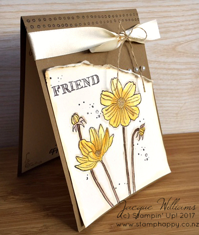
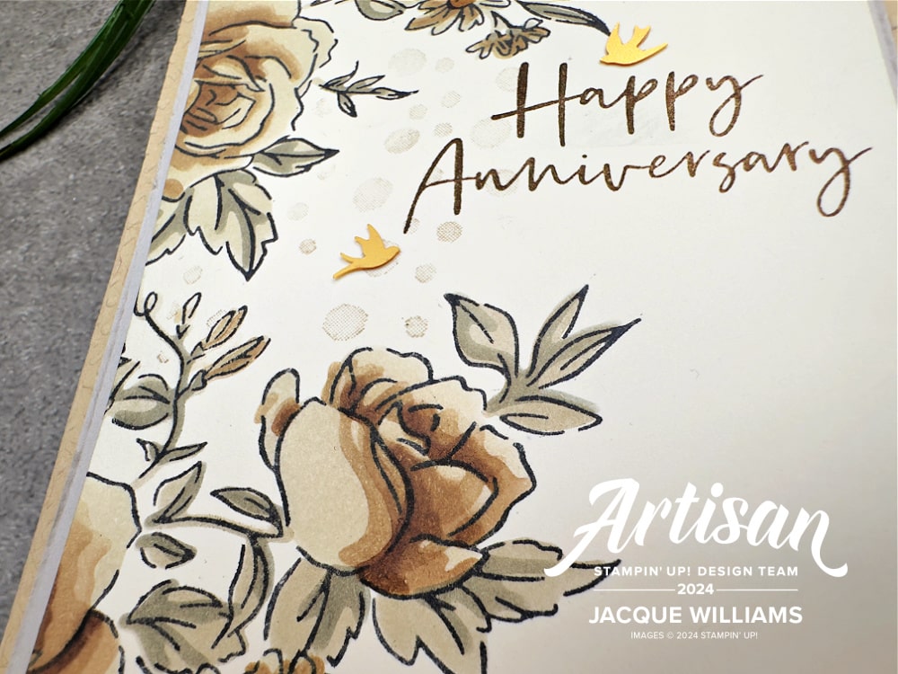
I’ve used a Soft Suede base and watercolour paper as the mediums. The Watercolour Paper adds both a nice weigh to the project, but is also the most excellent choice for blending colours. A simple ribbon and a few pearls accent the watercoloring. It also felt a bit bare when I was finished, so I added a few black splatters, which somehow just really finishes it off.

I’ve used our four challenge colours for the image in varying degrees. The Delightful Dijon is actually quite a nice yellow – not overly bright and with a tinge of brown to it. As you can see, I did a bit of mixing of the colours. My watercoloring tends to be a bit on the messy side, but I quite like it that way. Try it! And don’t be afraid to leave a bit of white space in your images, either.

I made a little tutorial video for this project and tried another version of the same colours – this time colouring the flower petals directly in Soft Suede. LIke my post from yesterday, brown flowers can actually look quite good!
I do hope you play along with our colour challenge. Just create using the colours above, and post your project to the Colour Inspiration Facebook page!
I know you’ll enjoy what Kelly Kent has in store for you next!

Thanks for stopping by!

P.S. If you’re in New Zealand, and don’t have a demonstrator, I’d love to be yours! Please request a free copy of the latest catalogue HERE.


I agree. This stamp set is gorgeous for watercolouring. Beautiful cards and the brown flowers do look lovely too.
gorgeous as always Jacque- I’d happily come to one of your classes! love the monochrome flowers – and you make brown look amazing!
So lovely Jacque – I love the contrast between the shabby & crisp finishes. All your flowers look amazing, no matter the colour! Kelly x
Love your water colouring, it is amazing! Beautiful card design, TFS xx
Gorgeous watercolouring!! Pretty pretty pretty! X
Such pretty cards Jacque! Who knew brown flowers could look so stunning!
Very pretty flowers
A great set to watercolour Jacque and that Dijon just makes the perfect flower colour .. LOVE! T
Such beautiful cards, Jacque. Those browns & yellows are perfect for these flowers. I enjoyed hearing we have a similar style with water colouring – messy!
Jacque this is just gorgeous. How you managed to make this rather sombre combo look light and bright is beyond me. Just stunning.
Love your colouring, looks gorgeous!
Your water colouring is just beautiful Jacque, and I totally agree that the black dots really does set off the card.
Just beautiful, Jacque. The water colouring of your flowers and around the edges of your creations is perfection. And sweet details. D xox
Love the shabby yet modern take Jacque. The details are just lovely and so, so pretty! xx
Beautifully watercolored, Jacque and those flowers are perfect for the challenge colours.