Easy Torn Card Technique with Texture Chic
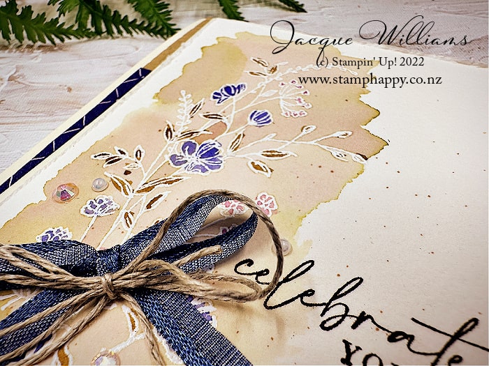
Today’s share is another version of the card I shared yesterday, this time with printed paper on the outermost layer, too. I thought it would be a fun look to have the rolled layer be a double sided print, so both sides would ultimately show. This works best if the two sides coordinate with each other.

I’ve used the gorgeous Texture Chic Designer Series Paper here. In this sample, I used one side for the top layer, and the other side for the second layer. Therefore, the “roll” doesn’t stand out as much as it could because it’s actually the same print as the second layer.
I love this print so much that it’s my phone’s lock screen!
For this version, the “print” is in both papers, and the roll back reveals the sentiment. I love this look so much!

I’ve added a few leave here from the Chic Dies from the Season of Chic bundle, just for a bit of dimension to the project.
I’ve been using the Distressed Gold papers quite a bit. I love how they it does look like an antiqued gold, and it isn’t too shiny for a more vintage look. It does come out looking like gold foil with bits scraped off.

Click here for a complete supply list for shopping, printing, or saving for future reference.
If you’d like to see how to make the Torn Card look, please enjoy this short video below.
Subscribe to my YouTube Channel for more tips and weekly project ideas!
Thanks so much for stopping by my stamping and crafting studio in New Zealand today! ~ Jacque Williams