{Stampin Up Scrapbooking Sweet & Silly}
Today was an enjoyable day in my craft room, despite the constant bickering in the background . . .
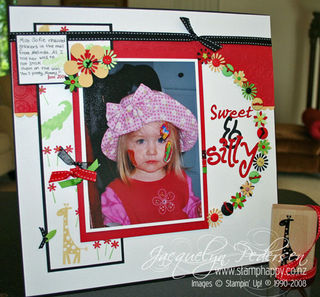
The colour challenge today was r![012009-colors[1]](https://stamphappy.co.nz/wp-content/uploads/2009/01/6a00e553b9886d8834010536f005eb970c-320wi.jpg) eally a challenge!! I don't prefer to use such stark colours in my pages, but I applied a colour principle here- there is a certain technique to use when the colours are bright or you don't really like them together . . can you guess what it is? Email me with your ideas and I will give a pack of dimensionals to the first person who can read my mind! The answer and any other
eally a challenge!! I don't prefer to use such stark colours in my pages, but I applied a colour principle here- there is a certain technique to use when the colours are bright or you don't really like them together . . can you guess what it is? Email me with your ideas and I will give a pack of dimensionals to the first person who can read my mind! The answer and any other  good suggestions posted next week.
I've also combined this challenge with a sketch challenge found on http://www.pagemaps.com/ - a fun resource for layout inspiration!
The stamps used here are Wild About You, a favourite of almost everybody. It's such a cute set for children and mixes nicely with flowers, too. Most of the flowers are punched using just the one punch, Spring Bouquet. One can get a lot of looks with that one purchase! And can you see the scallop edge used here? I did go all the way across, but in the end, only a bit peeped out.
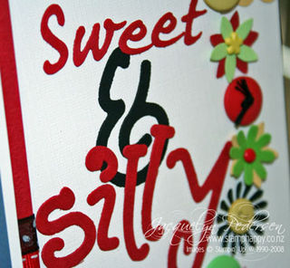
I have also used a cuttlebug folder on the textured Real Red card (what a cool look with two textures!), miscellaneous ribbon, and buttons and brads to match. I have also added beads to the flowers, as you can see in the close up. Beads can be  adhered using Stampin up's Crystal Effects- just give it plenty of time to dry.
The fonts are done with the old sizzlits. I know, I know, I must be archaic!! They are script font and the Monkey Business font. They may be old-fashioned, but they still work great and I am a sucker for cool fonts.
Only when I was nearly finished did it occur to me that these colours would make the perfect ladybug layout . . .OH, well, next time someone remind me! I have such a thing for ladybugs; who  knows why it didn't cross my mind earlier.
I have spent the Christmas holiday sorting through photos (throwing out hundreds of old boyfriends – don't need to go there), so now I am ready to roll this year with lots of pages!


Wow that’s a lot of work there Jacque! Looks like a lot of fun had putting it together. Colour technique, hmm… how about – choose the colour you most like, to have as the main colour, then just use the others in small amounts as accents? Oh and use plenty of white of course, to tone it all down a bit and break it up?
Good comments, Rach, and quick, too! All will be revealed next week!
what a gorgeous layout Jacque.
Wow, Jacque, this is an awesome layout! Absolutely love it! Yeah, you right, the colour combo would make a lovely lady bug theme 🙂
This is super cool! Love all the little details! And, I love the fonts, too! 🙂
I love the details in this lo… marvellous!
Oh wow Jacque your page is fabulous!! I absolutely love it and the colours go perfectly with that gorgeous photo.
I’m sure you’re bound to make it into KW’s top ten – good luck!
Jo 🙂
I love that you made a sb page from this color combo. The stamp set and flowers you added go perfectly with your adorable photo.
Such a fun layout!
Ohhhhh. Lovely and sweet!!!! Very pretty your work!!! Thanks to visit my blog.
Kisses from Spain from another fan of scrap!!!!
Hermosa tu Card amiga,todos tus diseños son muy lindos,yo apenas inicio en este maravilloso mundo,estare visitando tu blog porque es hermoso,felicidades…
Oh this is just great – I love the flowers, well really I love it all. This is my first visit to your site and I am really impressed with everything you do – I will be back.
Jacqueline,your page is so gorgeous and full of little details
And the young girl is so cute.
Love it
Katou
Thanks for your little comment on my blog
I love the scrapbook page. Also, the story. My days of fussy, fighting children are long gone. I have two girls, then two boys. It was very often overwhelming when there were three teenagers and one youngster. Thanks for visitng my blog!
Wow such a lot of work. Its lovely and well worth all the effort. Well done.