A Quick Lesson on Which Ink Colors Beautifully Mix Together
A brief discussion about color: sometimes you want to blend or mix your colors to create an ombre or rainbow-type of effect, but when the colors meet, they mix into something that is unappealing or just doesn’t work with the rest of your project.
So how do you know which ones will blend seamlessly, or at least won’t blend together to make an unplanned brown?
In today’s video, I’ll share with you an easy to remember tip on which colors to use with which so you will always end up with an attractive “blended color” in between!
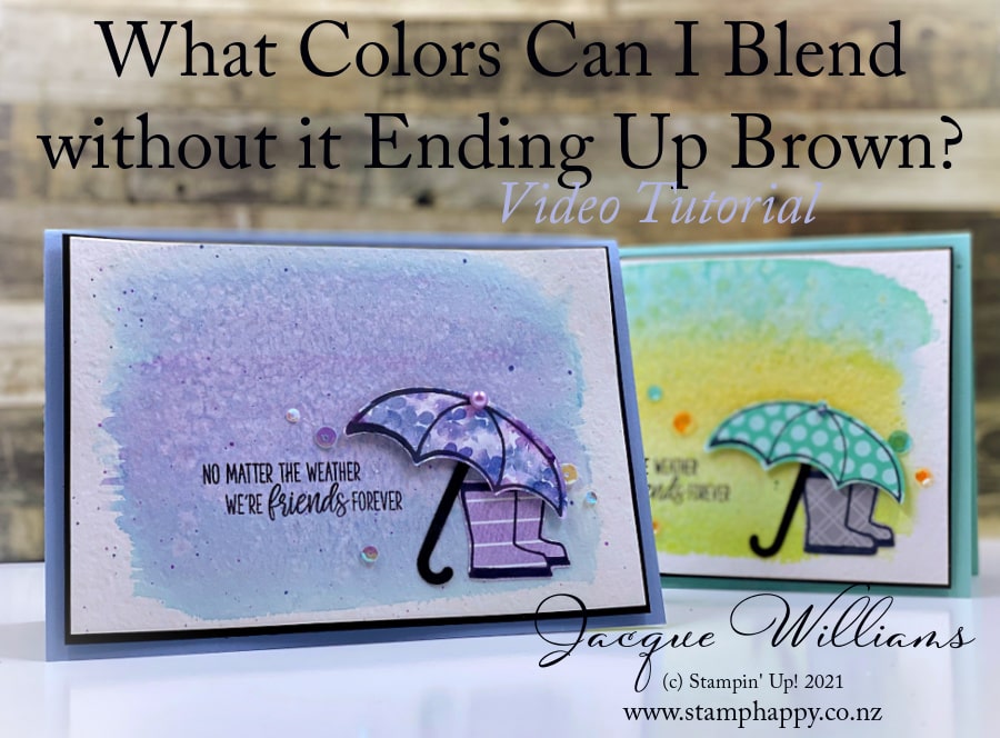
I’ve made a simple card to showcase this technique, featuring the Under My Umbrella stamp set and Umbrella Punch as a quick, adorable focal point.
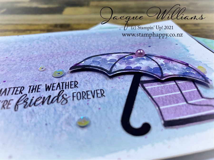
Both images were stamped on the Hydrangea Hill papers in this sample. I used the punch for the umbrella, and then did some quick cutting with the scissors for the boots.
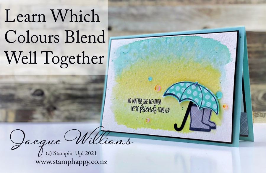
In this version, I wanted to brighten it right up with the bright colors of Bermuda Bay, Bumblebee, and Granny Apple Green. Click here for a complete supply list to print, save, or use for shopping.
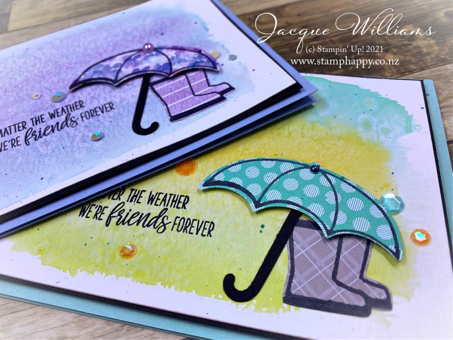
In this video, I’ll share with you a little bit about color and the principles behind which colors work well for mixing or blending. I’ll also show you the Rock Salt Technique. Next, I’ll take you through the measurements and assembly for this adorable card.
Enjoy the rest of the hop! And please subscribe and/or comment while you’re there!
Thank you so much for stopping by today! I appreciate you and your support ~ Jacque Williams
