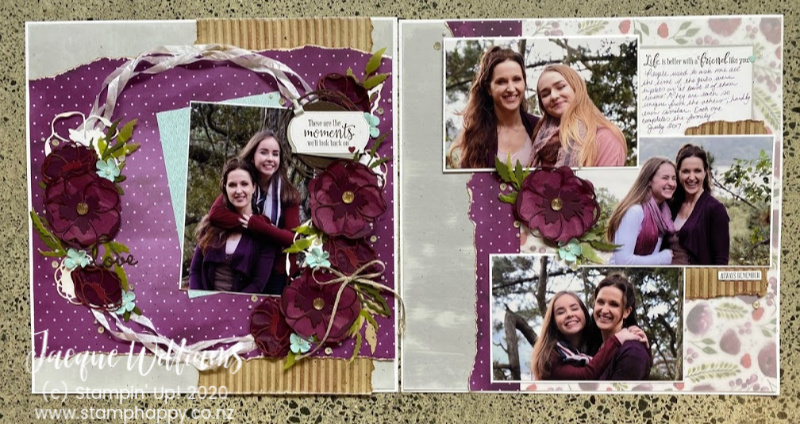
Yay, it’s Friday! Today’s share is a double layout, inspired by a single layout shared by fellow Stampin’ Up! demonstrator Leaf & Leaf (sorry I could not make out the person’s name on the photo). It’s a beautiful layout, although I changed it up a bit to make it more suitable for a class:

Plus I added a second, complimentary page. I kept that page fairly simple as the first page will take a bit of care to complete. Both pages use the entire Painted Poppies suite (two sets of complimenting dies, one stamp set, those gorgeous papers, and the White Seam Binding Ribbon).
Product List
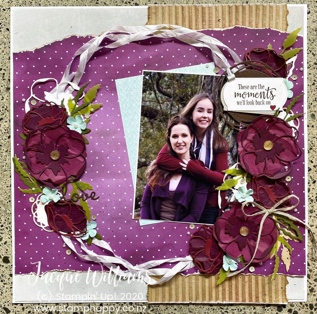
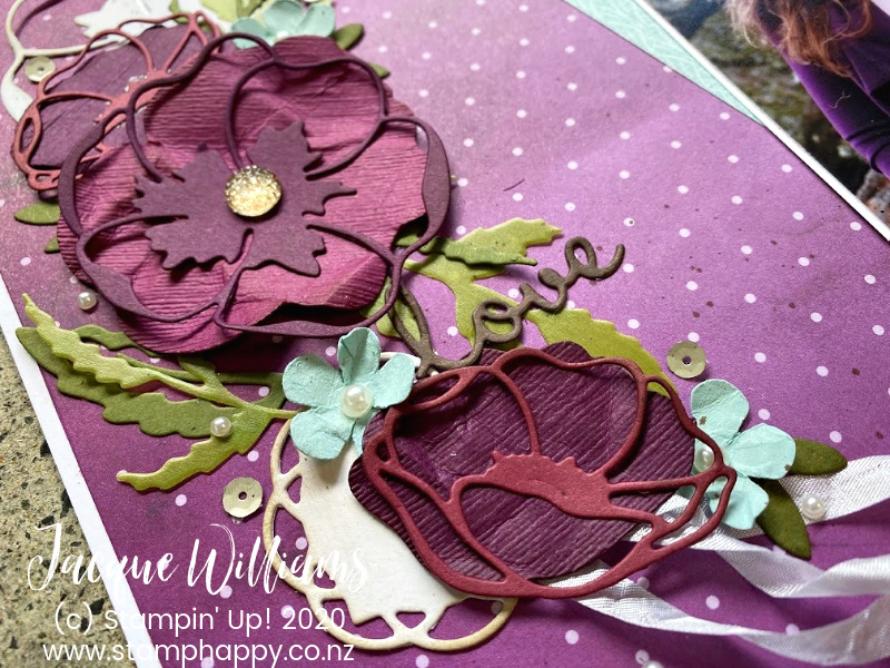
The first page is a gorgeous wreath style with one focal photograph. I used a bowl from my kitchen to first create the circle shape and then worked the ribbon and die cuts around that circle. And that little flower? That’s the Small Bloom Punch, which is a free SaleABration gift with a qualifying order! It works really quite well with the larger poppy flowers and adds just a touch of contrasting colour.

I put a whole lot of sequins and pearls on this, too. It’s quite a rich layout with deep colours and a lot of embellishments. I guess after the summer break I was up for something like this! The new White Seam Binding ribbon is just so nice; so soft and pliable. It lays right where you want it to.

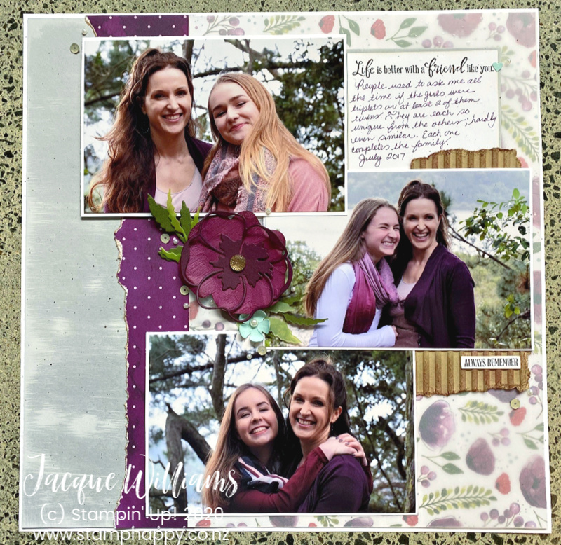
And the coordinating page has many of the same elements, but just a lot less. I also brought in some of the pretty printed papers, but I did cover it with vellum as the colours were more vibrant than I wanted next to the photographs. Personal preference; you may have less colorful photos and the rich colours may look perfectly in place without the vellum.
Thanks for stopping by! I hope you can join me in a scrapbooking class in the next month or two and do this layout with me!


Leave a Reply